


“It was a great honor to receive the “PAC 2019 Best of Show award in Packaging Innovation” for the AeroFlexx package. Packaging is critically important to the overall consumer experience with a product, and this award has a tradition of highlighting outstanding new packaging innovations. As we continue with AeroFlexx commercialization, the PAC award gives us great credentials among the industry and brings significant publicity to our innovation. Thanks to PAC for considering and selecting AeroFlexx as the award winner for 2019!”
Best of Show
PACKAGE INNOVATION
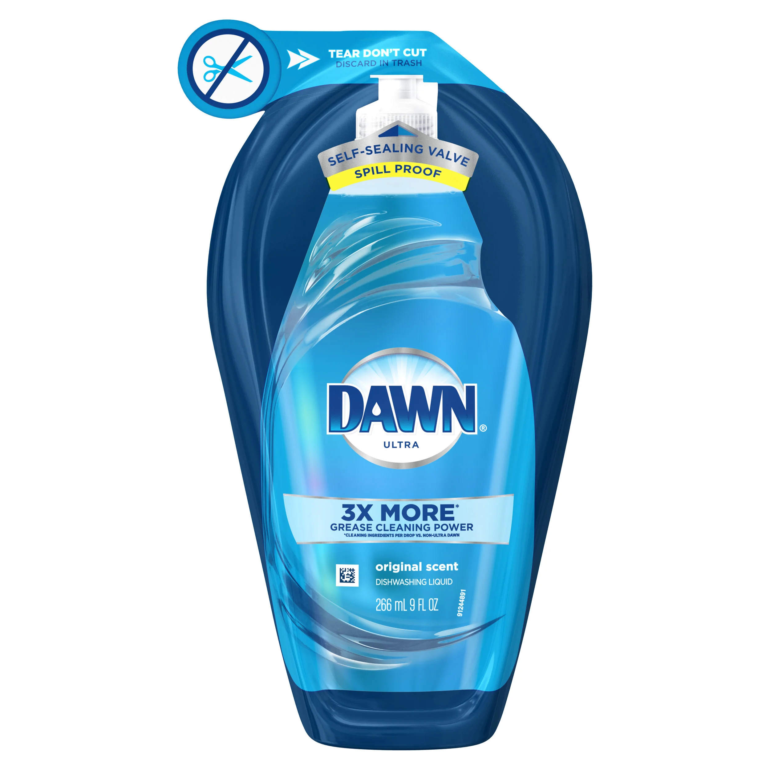
Brand Name: Dawn
Brand Owner: The Procter & Gamble Company
Best of Show, Package Innovation, e-Commerce is awarded to The Procter & Gamble Company for their Dawn entry. The package branding and graphics are designed to help the consumer identify the product as Dawn, using the iconic Dawn bottle shape in the artwork. The tear strip at the top of the package is perforated to specifications to ensure no premature opening during shipment while being easy to open by the consumer. The one-way valve helps the consumer to easily dose the desired amount of product without mess.
The package can be recovered after use for alternative energy applications where available. Efforts are underway by P&G and industry groups to enable packaging like this to be collected and recycled. The Dawn air assist package can be easily shipped to consumers in a corrugate shipper without additional protection.
“It was such a proud achievement for Design Bridge Shanghai to Win the 2019 Best of Show, for Marketing, for the 2018 Starbucks Mooncake Campaign. To achieve such a prestigious award in our first year of operations was recognition that Design Bridge Shanghai can deliver the global excellence that brands worldwide expect from Design Bridge. Whether we are talking to a global brand wanting to launch in China, or a China brand looking for international appeal, the award really helps us stand out in a very competitive market.”
Best of Show
Brand Marketing
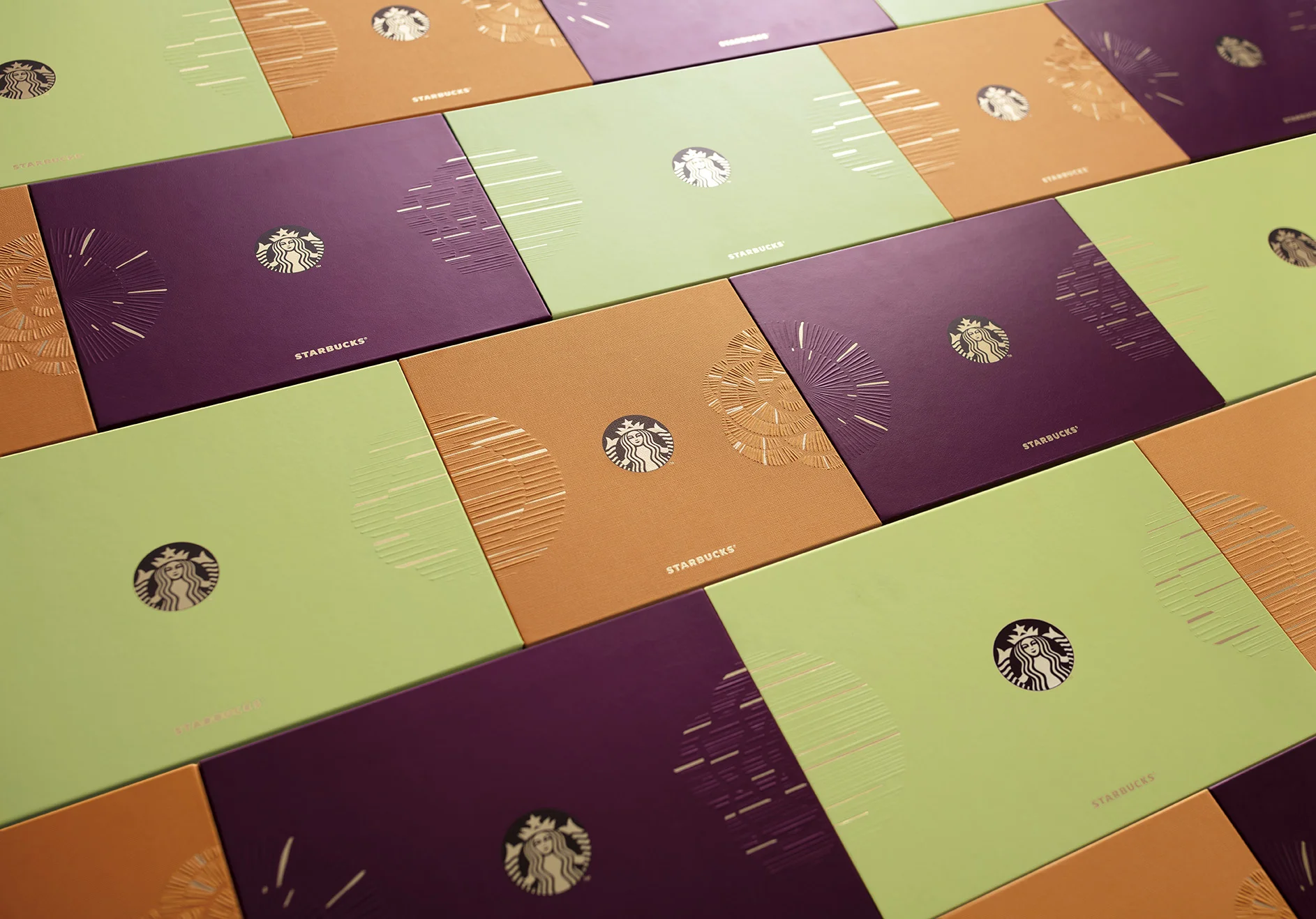
Brand Name: Starbucks
Brand Owner: Starbucks China
Brand Agency/Graphic Designer: Design Bridge
Pre-press/Structural Designer: Pre-Press = Design Bridge. Structure = Starbucks suppliers
Packaging Converter/Printer/Raw Materials: Starbucks suppliers
Best of Show, New Brand, Seasonal, Promotional, Limited Edition is awarded to Design Bridge for their Starbucks China entry. These mooncakes are sold exclusively in Starbucks stores during the Mid-Autumn Festival for lunar appreciation and moon watching, when mooncakes are regarded as an indispensable delicacy. At this time, the Chinese market is flooded with mooncakes, creating an extremely competitive landscape, with big well-known brands as major players and competition. The Starbucks China mooncake design and packaging stood out both in and out of store, with an eye-catching and colorful look and feel. With three tiers of packaging available – tall, grande, and venti – each was delivered with its own structure, paper substrate and print process - creating a challenge to ensure the range looked coherent.
Best in Class
New Brand,
Food & Beverage
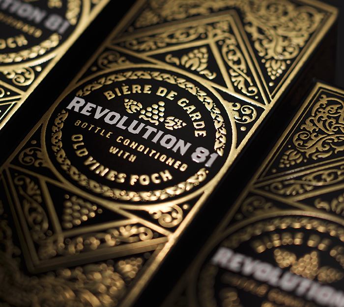
Brand Name: Revolution 81
Brand Owner: Radical Road Brewing Co.
Brand Agency/Graphic Designer: Bridgemark
Pre-press/Structural Designer: C.J. Graphics
Packaging Converter/Printer/Raw Materials: C.J. Graphics
Best in Class, New Brand, Food & Beverage, is awarded to Bridgemark, for their Revolution 81 entry, a Radical Road Brewing Company offering. This beer was created to be a premium offering, needing the presentation to stand out from most craft beers. Revolution 81 exhibits the special nature of this offering by packaging each bottle in a single box. The box showcases the extreme and beautiful details of grapes and their vines, alluding to the unique brewing process, which involves adding wine. -- The box features an innovative new printing process bringing to life raised metallic ink that has been applied by a unique digital press.
Best in Class
New Brand,
Food & Beverage
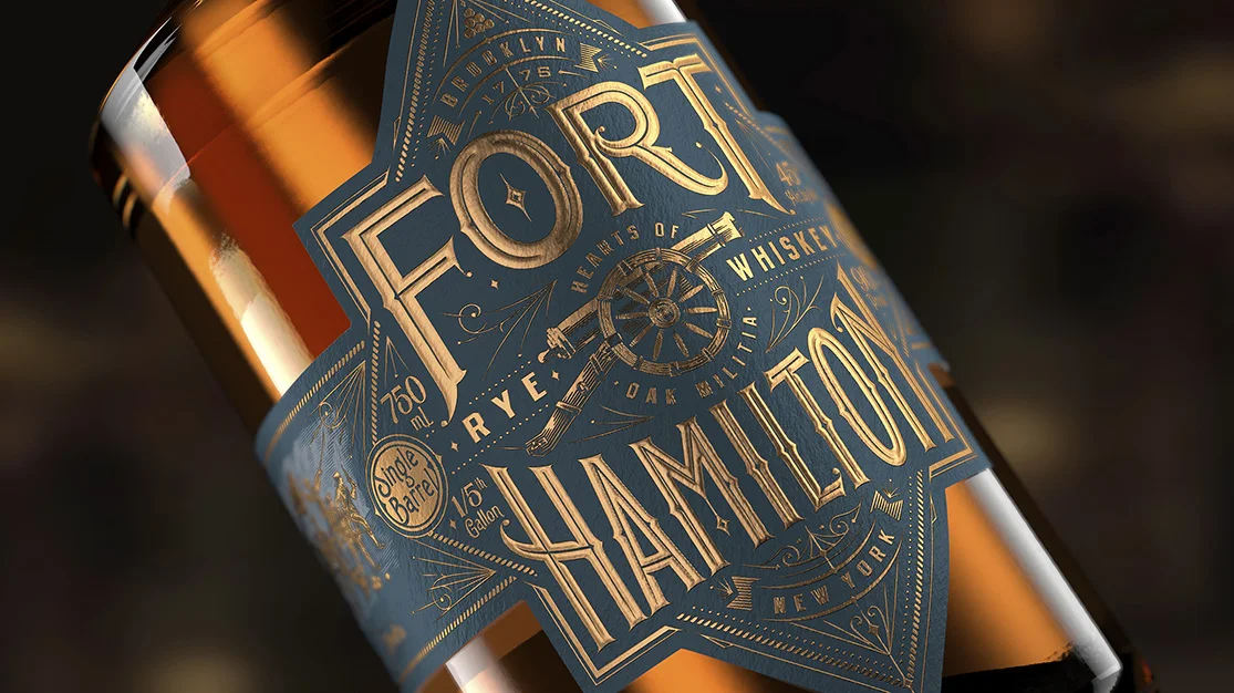
Brand Name: Fort Hamilton
Brand Owner: Alex Clark Spirits
Brand Agency/Graphic Designer: Bulletproof
Pre-press/Structural Designer: Bulletproof
Packaging Converter/Printer/Raw Materials:
Best in Class, New Brand, Food & Beverage, is awarded to Bulletproof, for their Fort Hamilton entry, an Alex Clark Spirits brand. The Fort Hamilton brand mark and typography were inspired by military insignia and signage of the time and flanked by filigree. Showcasing the challenger mindset and Hamilton’s untiring spirit reinforced by the rallying call for ‘Liberty or Death’. – A whiskey brand that blends the old world of revolution with the new world of craft. The package design encapsulates the bold, daring spirit seen at Fort Hamilton, while allowing the consumer to discover a new piece of story each time they pick up the bottle.
Best in Class
New Brand,
Non Food
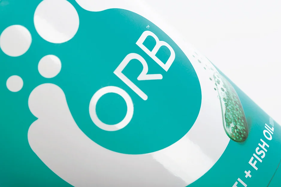
Brand Name: Orb Vitamins
Brand Owner: Corr-Jensen Inc.
Brand Agency/Graphic Designer: forceMAJEURE Design
Best in Class, New Brand, Non Food, is awarded to forceMAJEURE Design for their Orb Vitamins entry, a Corr-Jensen Incorporated brand. Their approach to graphic and structure design embraces bold, vivid colors that not only aid in variant differentiation but are powerful on-shelf next to the competition. -- A break-through from traditional vitamin packaging, the rounded forms of both the primary and secondary packaging are friendly and approachable, mirroring the shapes of the unique pills. The packaging showcases an iconic brand mark for Orb that balances a bold, graphic icon with a trustworthy wordmark. The frosted, tactile, soft-touch varnishes and metallic silver foils were the finishing touches in articulating a premium finish.
Best in Class
New Brand,
Luxury
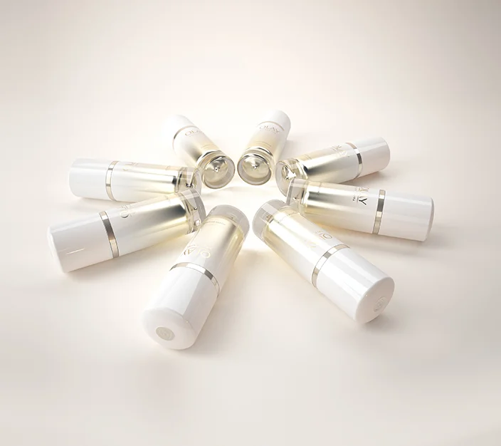
Brand Name: Olay (Golden Aura boutique)
Brand Owner: The Procter & Gamble Company
Brand Agency/Graphic Designer: Nicosia Creative Expresso Ltd. (NiCE Ltd.)
Pre-press/Structural Designer: Nicosia Creative Expresso Ltd. (NiCE Ltd.)
Packaging Converter/Printer/Raw Materials: RPC - HVD Engine; Yonwoo – Preto Engine; Kurz – Custom Foils; Red Spot – Custom sprays
Best in Class, New Brand, Luxury is awarded to Nicosia Creative Expresso Ltd., for their Olay, Golden Aura Boutique entry, a P&G brand. Design builds on category norms by providing a fresh take on the benefit of communication and story-telling through layering of materials, use of glows, gradations and biomorphic detailing. It overcomes barriers through a fresh approach, appealing to younger users who appreciate luxury and the sense of transformation. The team focused on allowing complete dispensing of the product – making sure final packaging leaves no waste and keeping packaging in the hands of the consumer for longer, creating more value and minimizing environmental impact.
Best in Class
New Brand,
Limited Edition, Promotional, Seasonal
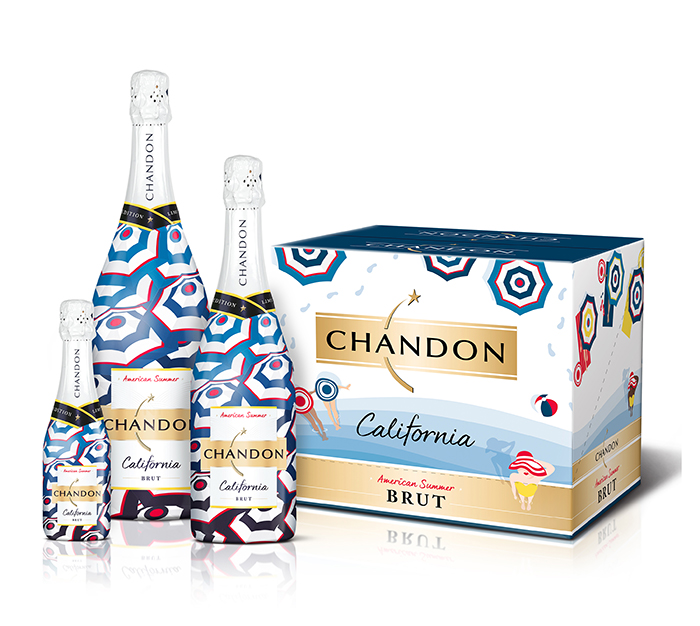
Brand Name: Chandon
Brand Owner: LVMH
Brand Agency/Graphic Designer: Interbrand
Packaging Converter/Printer/Raw Materials: Sleever International, Landmark Label
Best in Class, is awarded to Interbrand for their Chandon entry, an LVMH brand. The packaging utilizes on-season colors that are bolder than the category standard and prioritizes design equities that are unexpected for sparkling wine with the use of stripes and sophisticated, yet playful patterns. The packaging graphics push on the category norm for sparkling wine by bringing in wider trends and influences from other categories and design styles that resonates with the millennial female market – opting to printing directly on to the bottle to stand out as unique to the category.
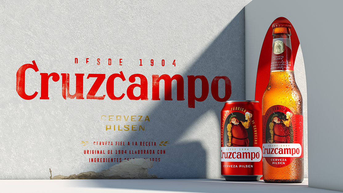
Best in Class
Rebrand,
Food & Beverage
Brand Name: Cruzcampo
Brand Owner: HEINEKEN
Brand Agency/Graphic Designer: Bulletproof
Pre-press/Structural Designer: Bulletproof
Best in Class, Rebrand, Food and Beverage is awarded to Bulletproof, for their Cruzcampo entry, a Heineken brand. The bold branding and packaging graphics centre around the much-loved Cruzcampo brand character of Gambrinus – reillustrated faithful to the mosaic discovered on the side of the Cruzcampo brewery – an old friend made iconic once again. The team paired Gambrinus with a new Cruzcampo logotype, inspired by the brewery signage in Andalusia and redrawn by hand to capture its timeless style. The team remained conscious that in the local market there was a returnable bottle scheme in place – an important driver for recycling. They endeavored to support this circular system by working within the existing bottle and label constraints, elevating the brand’s new look and feel through design and carefully chosen finishes, and enabling the returnable bottle scheme to continue.
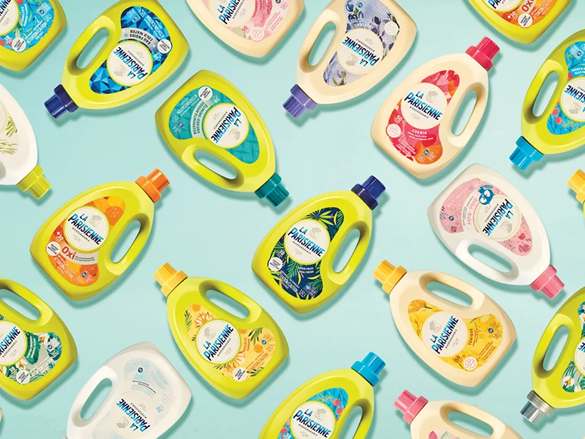
Best in Class
Rebrand,
Non Food
Brand Name: La Parisienne
Brand Owner: Lavo
Brand Agency/Graphic Designer: Pigeon Brands
Pre-press/Structural Designer: Structural design bottle: Lavo Inc.
Packaging Converter/Printer/Raw Materials: Group 2 (printer label)
Best in Class, Rebrand, Non Food, is awarded to Pigeon Brands, for their La Parisienne entry, a Lavo brand. Attractive and lavish, the effect created by the whole range of products makes one want to try every one of them. The colour palette, vibrant for detergents and soft for fabric softeners, makes it easy to browse through the product, while inviting to discovery. The block effect is created by the unique La Parisienne vibrant green bottle for detergents and the soft beige bottle for softeners. The illustrations and colours used for the whole range creates visual rupture from big brands at shelf level, and makes the new positioning clearly understandable for consumers.
Best in Class
Package Innovation,
Technical Design
Brand Name: Theory Wellness
Brand Owner: Theory Wellness
Brand Agency/Graphic Designer: HIPPO Premium Packaging
Pre-press/Structural Designer: Duallok Ltd
Packaging Converter/Printer/Raw Materials: Duallok Ltd
Best in Class, Package Innovation, Technical Design is awarded to Duallok Ltd., for the Theory Wellness brand, by HIPPO Premium Packaging. Despite being a child-resistant container, the package retains a very clean, minimal aesthetic. The physical packaging enhances the brand rather than allowing the child-safe design to detract from it. The package instructions sit quietly amongst the beautiful brand and graphic design scheme offering full visual impact. The relatively small, robust form-factor fits discreetly in a pocket and is well protected against damage during everyday use making it a great lifestyle accessory.
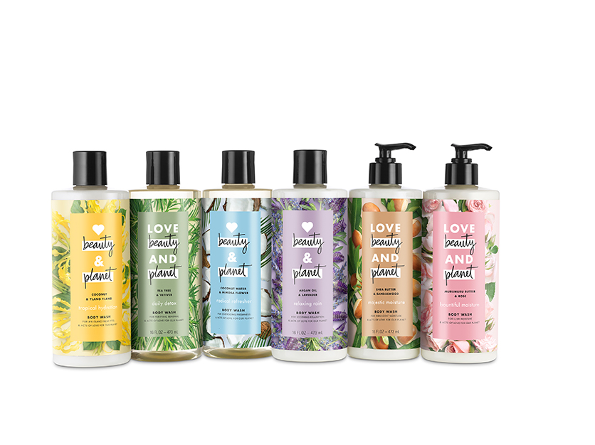
Best in Class
Package Innovation,
Sustainable Design
Brand Name: Love Beauty and Planet
Brand Owner: Unilever
Brand Agency/Graphic Designer: Jones Knowles Ritchie
Pre-press/Structural Designer: Axium
Packaging Converter/Printer/Raw Materials: Axium, M&H, CCL container
Best in Class, Package Innovation, Sustainable Design is awarded to Uniliever, for their Love Beauty and Planet entry.
Love Beauty and Planet was started by a group of like-minded people who believe that looking good and doing good should go hand-in-hand. The journey has been a holistic one, encompassing the entire product life cycle and beyond. Together, they have given thought to their ingredients, product packaging, and social partnerships, and are consistently working to minimize their environmental footprint.
Since launch, they’ve seen positive reception from editors, consumers and retailers towards their brand, purpose and packaging. Using 100% recycled plastic in shampoos and conditioners alone they estimate that they have saved over 300 tons of greenhouse gas and stopped over 150 tons of plastic from entering landfills.
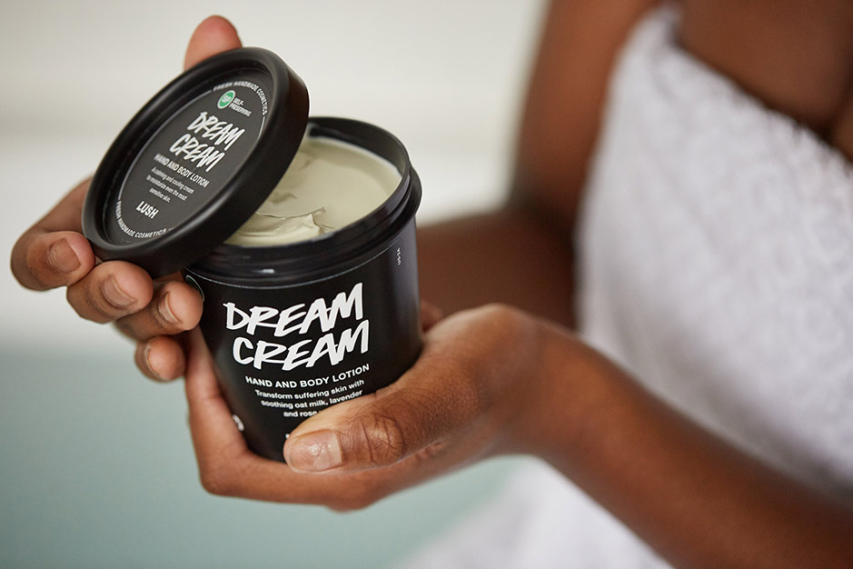
Best in Class
Package Innovation,
Sustainable Design
Brand Name: Lush Fresh Handmade Cosmetics
Brand Owner: Lush Fresh Handmade Cosmetics
Best in Class, Package Innovation, Sustainable Design is awarded to Lush Fresh Handmade Cosmetics for their entry. The life of Lush black pots begins with recycled plastic. Collected from curbside blue bins across Oregon, California, Washington and British Columbia is turned into flakes. The flakes are sorted into various kinds of plastics, including polypropylene, which is used to make these iconic black pots and lids.
The in-store "bring back" program helps close the loop by pushing returned black pots into production of new pots. The consumer returns five clean black pots to a store in exchange for a free fresh face mask. So much more goes into our pots than just luxurious products.