2020 PAC Global Awards Nominee Roundup - Week 2
Welcome to the PAC Global Awards Nominee Roundup! Each week we will be featuring five of the fantastic nominees, leading up to the ONEof100 Summit on February 18, 2020 where the winners will be announced.

Kit Kat
The Special Edition Kit Kat cartons are designed to be sold at a specialty Kit Kat store in the Greater Toronto Area, with Nestlé intending to provide an exclusive consumer experience, offering personalized Kit Kat bars packaged in unique and high quality packaging. These special edition cartons are produced in small quantities, with embossing, soft touch inks, high quality print and with short lead times. The team worked together to create packaging that provides a sense of exclusivity. This package is made with 100% recyclable paperboard and the consumer messaging encourages customers to recycle the package after use.
The Good Stuff
The Good Stuff is a new innovative range of no-rinse conditioners, each consciously tailored for different hair types and packed full with essential nutrients. The challenge was to simplify and elevate millennial women's haircare routine while delivering an eco-friendly solution. The bold design of The Good Stuff stands out on shelf next to competitors by expertly balancing its prominent brandmark, iconic tagline, and sustainable packaging. It is 100% recycled and recyclable packaging, with graphics that focus on the water-saving benefits of the product. It is also 100% vegan, with 0% dye and parabens.


Gaya Gold Coffee
This package has been specifically developed for Gaya Gold Coffee to give the coffee a high-class look in store. The full metal can gives the iced coffee the best possible barrier properties, allowing Gaya Gold Coffee to distribute the product in the hot Arabian climate while securing optimum freshness. This packaging is a perfect example of the circular economy in action.
Alkimi
The bespoke bottle shape and striking graphics clearly communicate ALKIMI's brand positioning while reassuring consumers that they are getting a powerful and highly efficacious product that is more natural and safer to use. The pack design reflects the science behind ALKIMI's power, with the brand symbol inspired by alchemist symbology, the synthesis of science and nature. A suite of ingredient symbols was created to inform consumers of the engineered nature of each ALKIMI product in a clear and understandable way. Dramatic surges of colour at the top of each pack hints at the scientific process inside and delivers clear range navigation. The ALKIMI bottle, trigger and sleeve are all 100% recyclable, in line with the brand's alignment with its natural origins and ingredients.

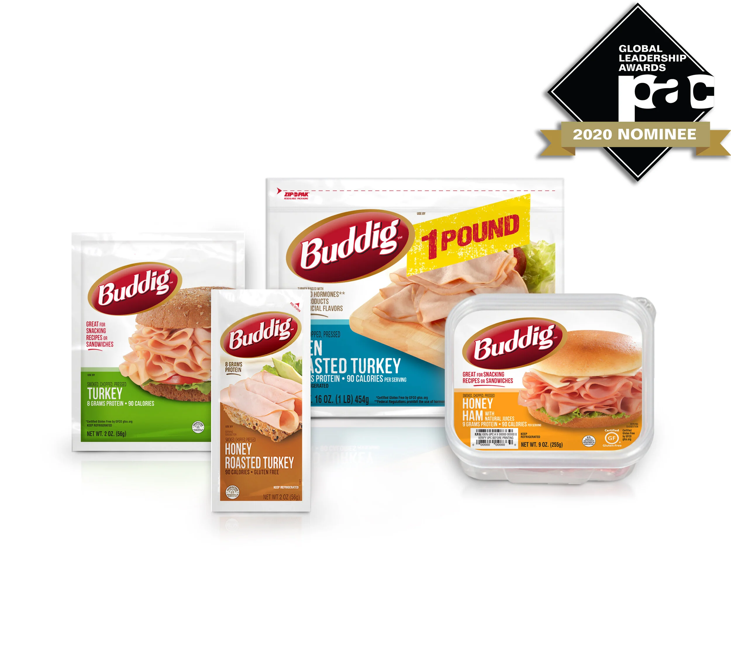
Carl Buddig
Buddig's goal was to maintain their brand presence and sales volume on shelf amidst a significantly smaller foot print. A new 50% narrower package structure was developed holding the same amount of meat but deeper, allowing them to keep the same number of SKUs in half the space. This created an opportunity to refresh the brand and connect better with consumers. They were able to keep the design modern and simple, by focusing on designing an updated brand logo, mouth-watering photography, and strong flavor differentiation. The combination of using colors on a white background created a fresh and vibrant package. The new package uses less materials than before, and is also recyclable.