
2020 PAC Global Awards Nominee Roundup - Week 6
Welcome to the PAC Global Awards Nominee Roundup! Each week we will be featuring five of the fantastic nominees, leading up to the ONEof100 Summit on February 18, 2020 where the winners will be announced.
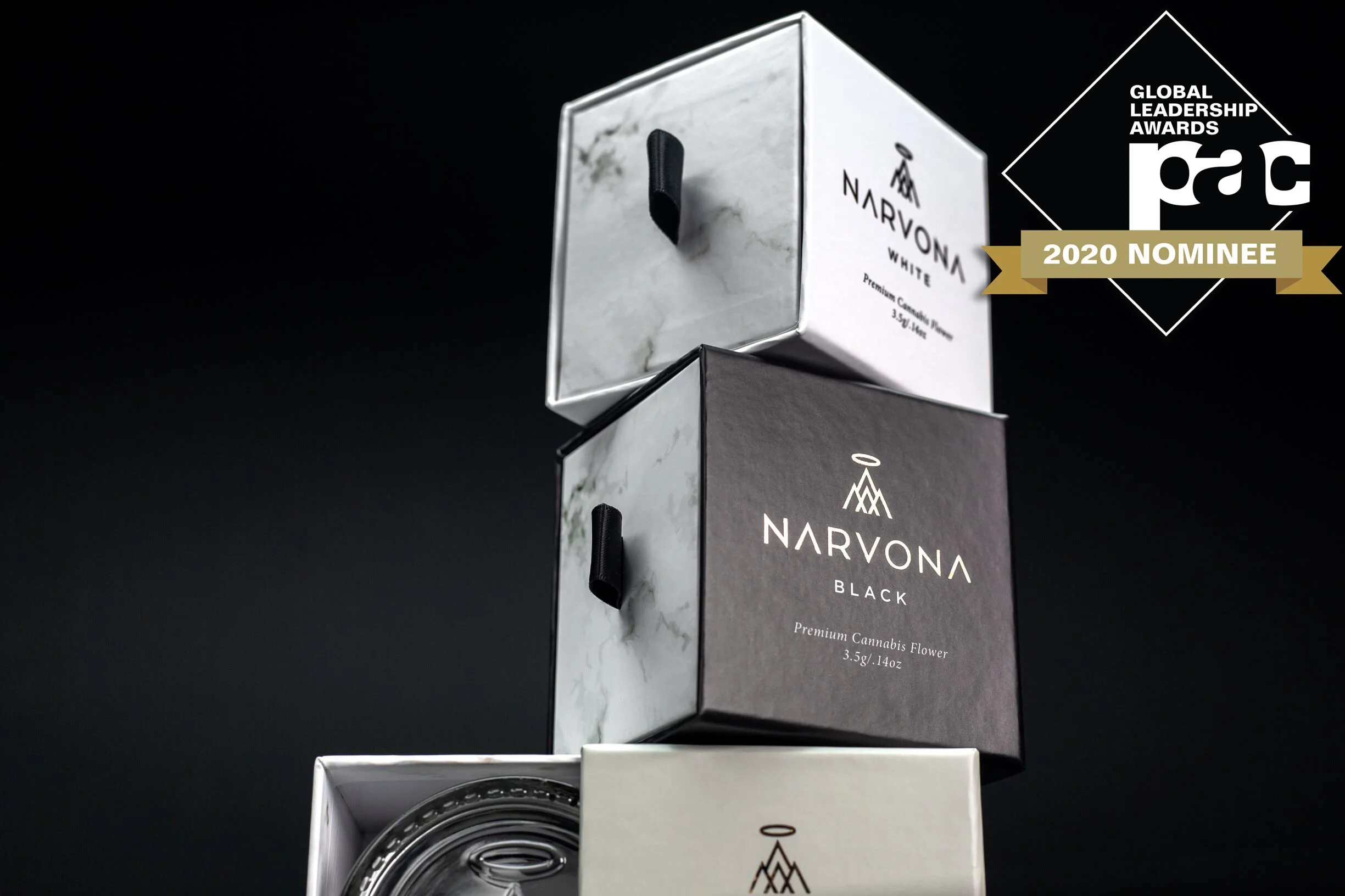
narvona
Narvona wanted to enter the market with branding and packaging the Michigan market had yet to see before. Glass jars, custom paper, embossed logos, and premium textures offer branding and multi-packaging solutions that strike a delicate balance between luxury and accessibility. When you open Narvona and see the custom embossed glass jars coming out of a high-quality marble casing, it creates an experience that cannot be duplicated.

sprinkles
Working together, the brand and design teams designed Sprinkles™ playful label and wordmark to capture the personality of the SUNSET® brand, with an emphasis on the qualities of youth and fun. The Sprinkles™ unique tomato-shaped custom clamshell emphasizes the product's fun and playful qualities. The pack's ergonomic shape and size fits in the palm of the hand and is easily "grabbable." This, together with Sprinkles™ impactful graphics, sets a new standard in snacking products aimed at consumers looking for items that will help get their children excited about healthy snacking options.
tide
The Tide Eco-Box cubed shape is designed to stack optimally on a pallet without additional packaging or protection. Upon receipt the consumer can easily assemble the outer box to create an easy dosing experience in their laundry room. By optimizing the packaging design and compacting the formula, a benefit of 60% less plastic was realized while continuing to delight the consumer in use. A Tide liquid laundry detergent bottle is prominently featured in the packaging artwork to communicate that the Tide product consumers know and love is inside.


selection cereals adult & sweetened
To better reflect Selection brand's focus on meeting its customers' daily needs, the new design was created to intentionally disrupt the category. It achieves this through the use of dynamic colour bars, variable and colourful type, and vibrant colours to contrast with the product itself. An overhead shot of a bowl showcasing product was consistently used across the entire cereal set to create a bullseye and unmistakable brand blocking. What was achieved is a simplified, stronger on-shelf presence that is clearly recognizable as Selection brand.
lovibles
The Lovibles design boasts an attractive, colorful and fun package that shows an imaginary world where an illustrated cat has many adventures looking for delicious food. The story, bright colors, and fun product names and kibble shapes are designed to attract the economy customer's attention browsing the aisle and intrigue them to pick up a bag of food. A closer look reveals fun product names, cute shapes, and vignettes that illustrate the cat's adventures and product information. Because of the strength of the brand and packaging design concept, it has the potential to expand to other type of products for cats.
For more information contact Andrea May at amay@pac.ca or visit www.pac-awards.com/2020-nominees to see all of the amazing nominees.
